Branding

CLIENT
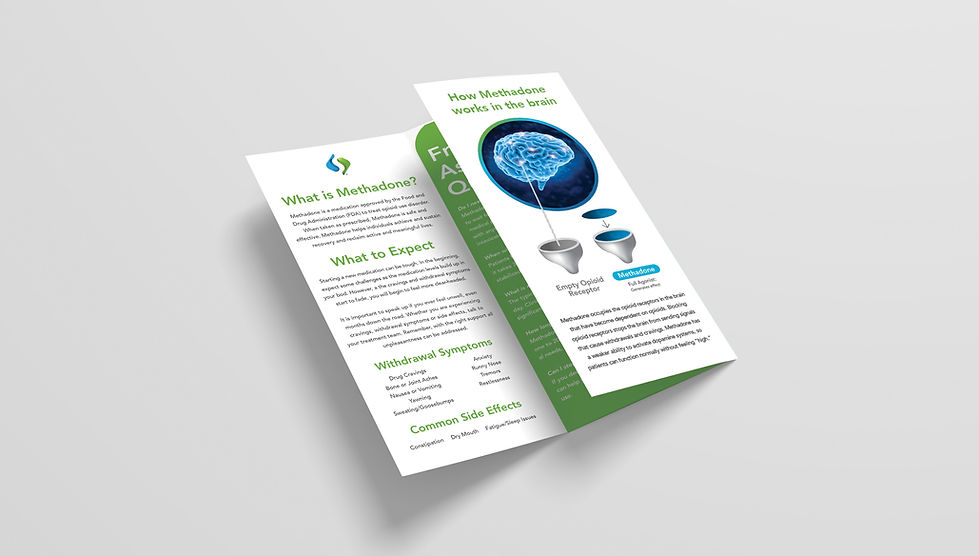
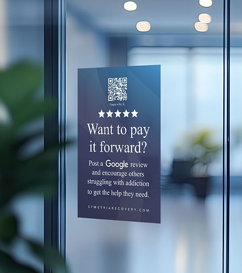
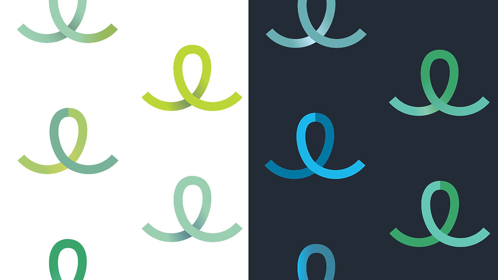
Symetria Recovery
A provider of outpatient addiction treatment services, Symetria Recovery needed to refresh their image with a full branding overhaul to set themselves apart in a highly competitive environment. To accentuate the company's mission of growth and change, branding elements incorporated fresh blues and leafy greens across a diverse body of design elements (color palette, gradients, shapes, etc.).


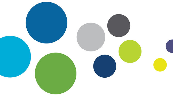
The color palette included primary, secondary and tertiary color options.

CLIENT
Springview Ketamine
This psychiatrist wanted a logo and branding package to make his practice feel approachable and human, setting his practice apart from more formulaic competitors.
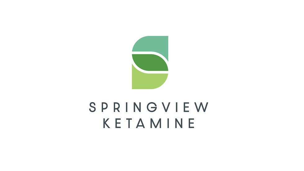
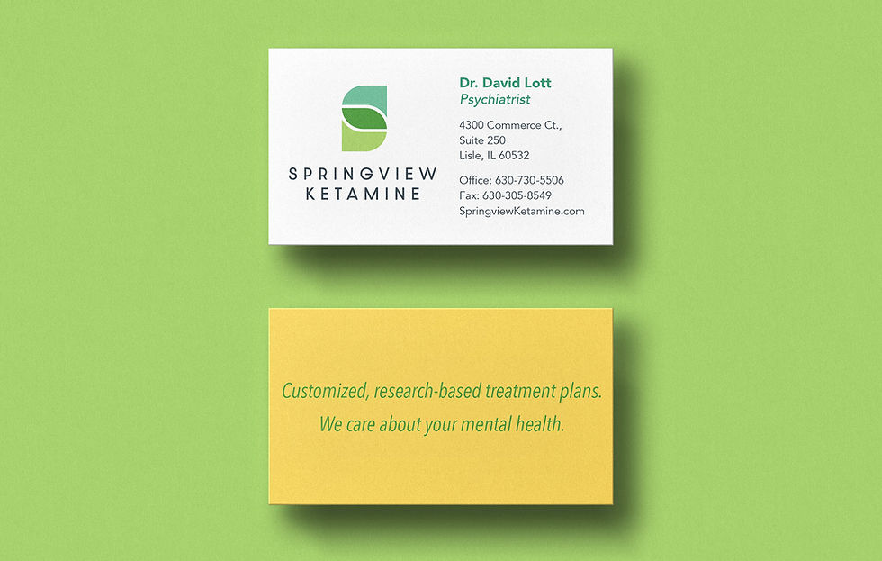
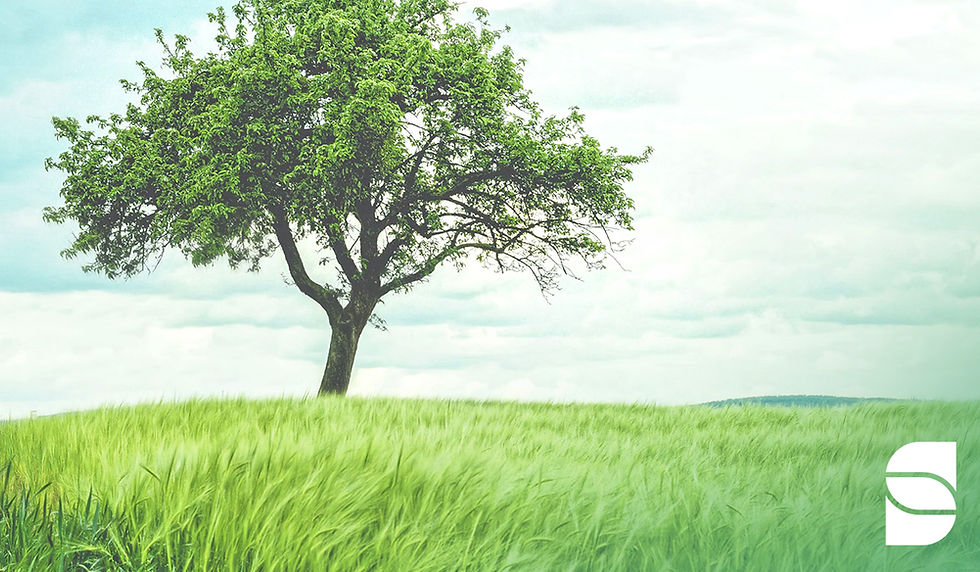
This brand focused on conveying approachability and confidence. This helps patients feel comfortable in asking questions about their health, while trusting the doctor's skill and expertise.

CLIENT
Albemarle Chemicals
This chemical company requested a mini branding logo lockup, conveying a sense of energy and excitement for an internal award.

As the branding process evolves, it's always rewarding to see elements start to sing and come together.
CLIENT
Excellence in Operations
This consultancy focused on communication training within organizations. The logo needed to look dynamic and professional.
CLIENT
WestPark Properties
This Charlotte-based real estate development, management and investment company needed a logo which felt enduring, classic and strong.
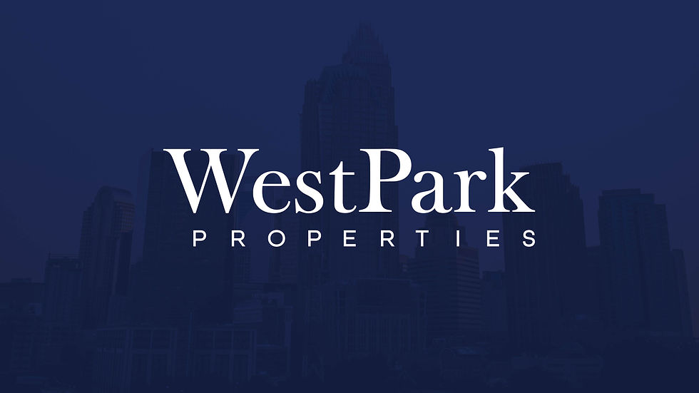

I paired the logo with a well balanced color palette that could be easily used in other materials.

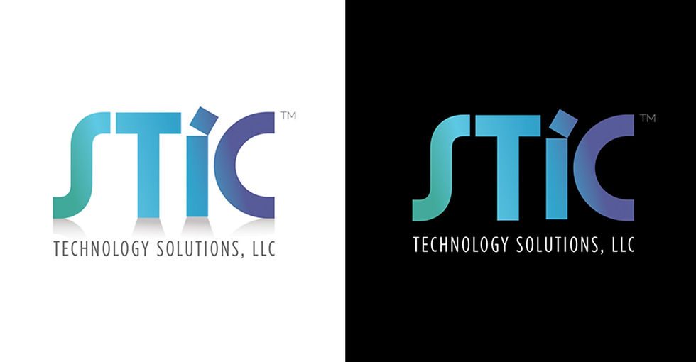
CLIENT
STIC Technology Solutions
This consultancy requested a logo which would convey the organization's strength in technology.

CLIENT
BD Futures
This business development firm needed a logo which felt professional, enabling the organization to establish itself as a respected leader in its field.

